This project was part of a semester-long class on UX Design. My team and I got to work on this real client project with Little Nail Lady Beauty or LNL Beauty. She is the owner of two nail salons and wanted a rebrand of her page and a redesign of the current booking process.
Our research focus included the following:
The target users were women between the ages of 28 and 35, career women, college graduates, and millennial women and mothers. We designed a mobile site for LNL Beauty, as a rebranding of its previous booking process and customer experience.
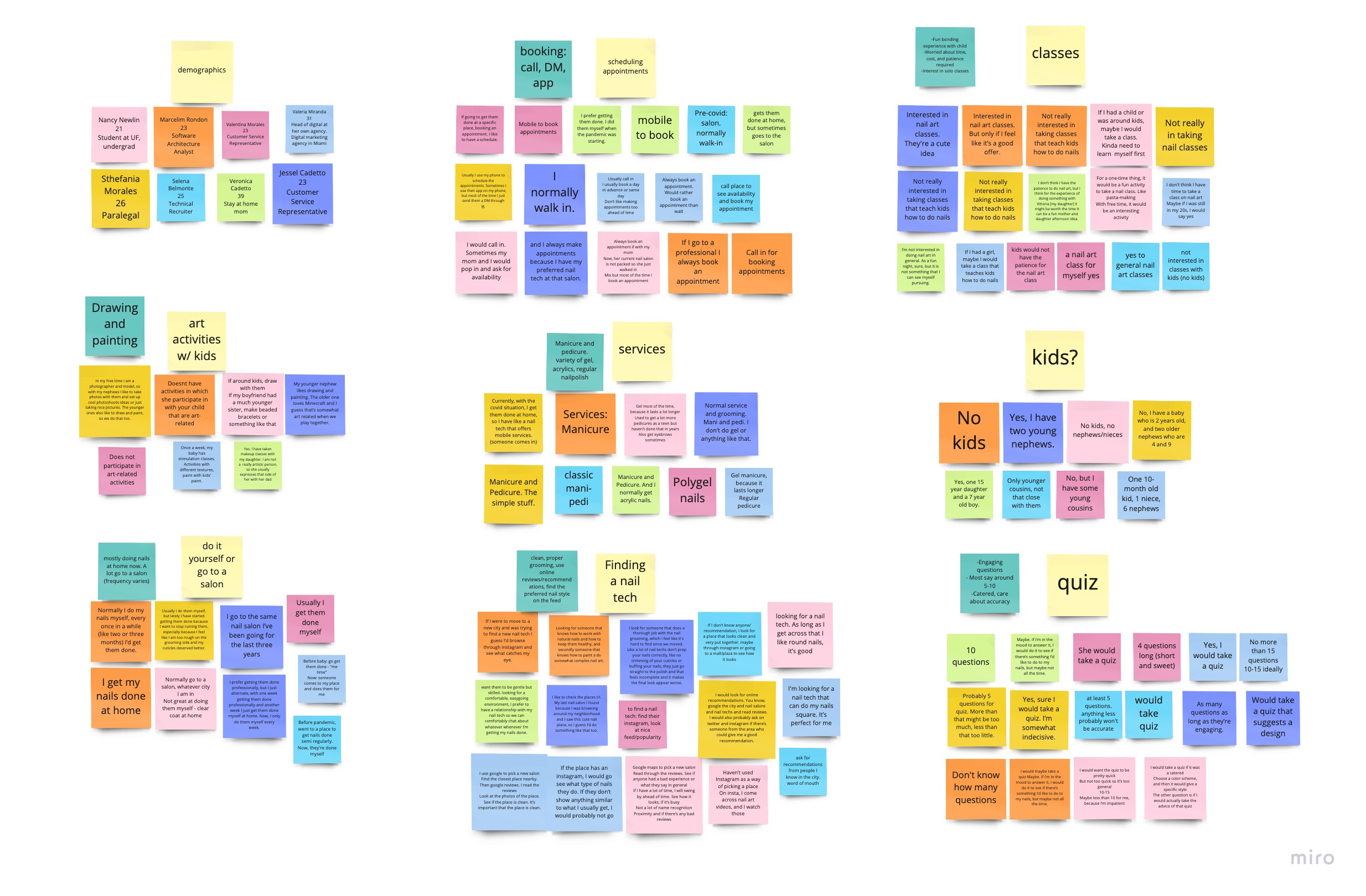
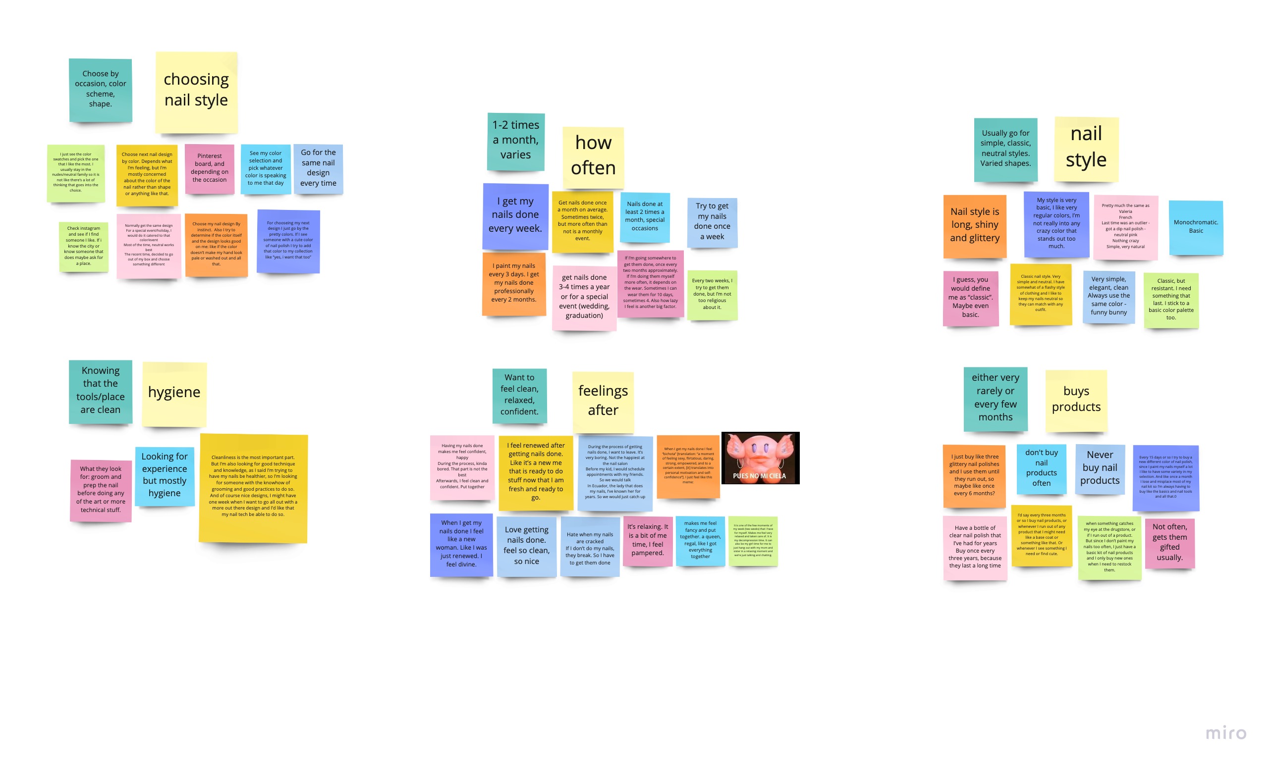
After conducting the focus groups, we recorded the raw response data in our affinity diagrams. We identified common themes and organized the sticky notes into these categories accordingly. After discussing amongst our team we were able to determine six main user needs. They are as follows:
Some breakdowns of the data were that people often do their nails at home and that they don’t buy nail products often. Most clients prefer a classic and neutral nail style where practicality is a priority. Also, among our focus group participants, most were more likely to be interested in taking nail art classes by themselves rather than with a child.
The opportunities in users’ current experiences included most choosing to call to book appointments. Some also had kids and younger nieces and nephews, which relates to the ‘Mini and Me’ classes that would be offered by LNL Beauty. When looking at a new nail salon, users noted that they look for reviews and testimonials and that the salon shows adherence to proper hygiene and cleanliness practices. Additionally, some often get their nails done for a special occasion and would like to customize the color scheme of their nail art.
We took all of these breakdowns and opportunities into consideration when designing our interfaces. The main takeaway from our research is that most if not all users used their phones to book appointments. Therefore, we decided to focus on designing mobile interfaces for this project.

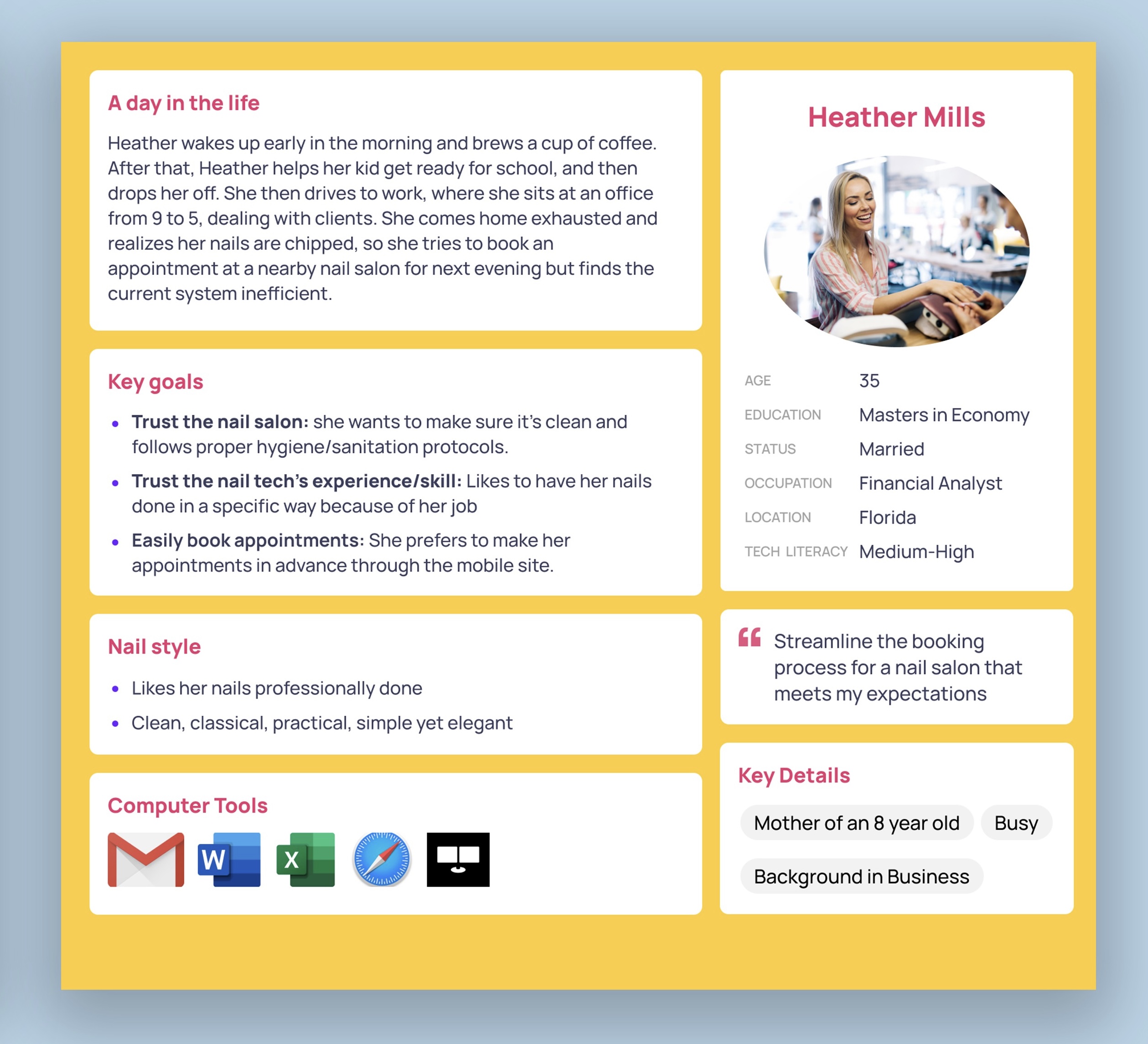
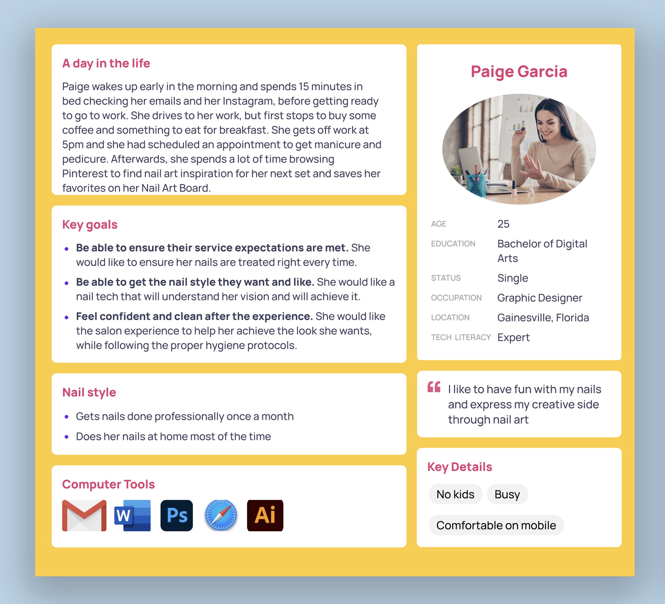
We created the following user personas to represent the main user needs.
After brainstorming and voting based on the defined user and client needs, we identified the core features of our app design:
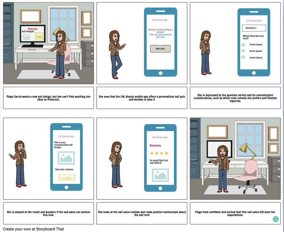
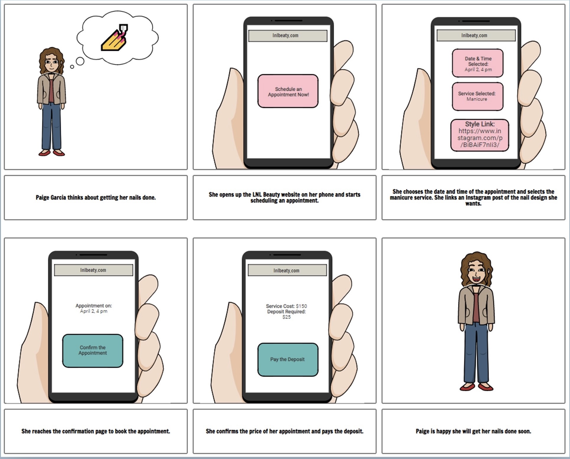
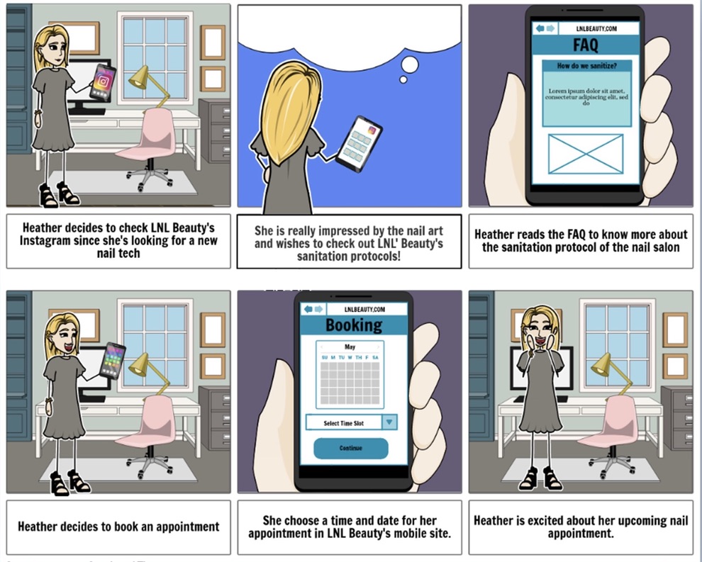
We made a user task flow that shows the flow of the application and the potential ways they can navigate it.
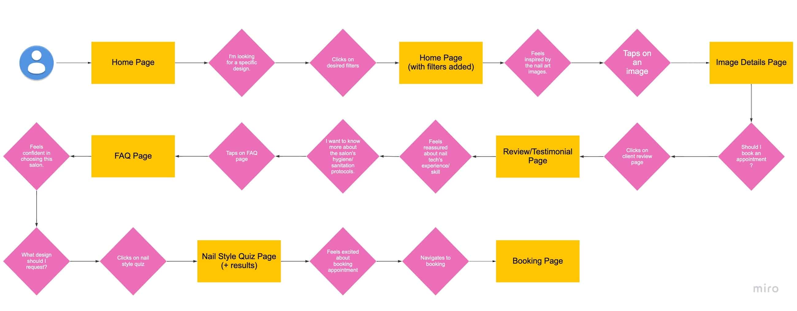
After defining the features that it needed to include we started sketching up some low-fidelity wireframes which we printed out to do a paper prototype user test to test three different alternatives of the booking appointment process.
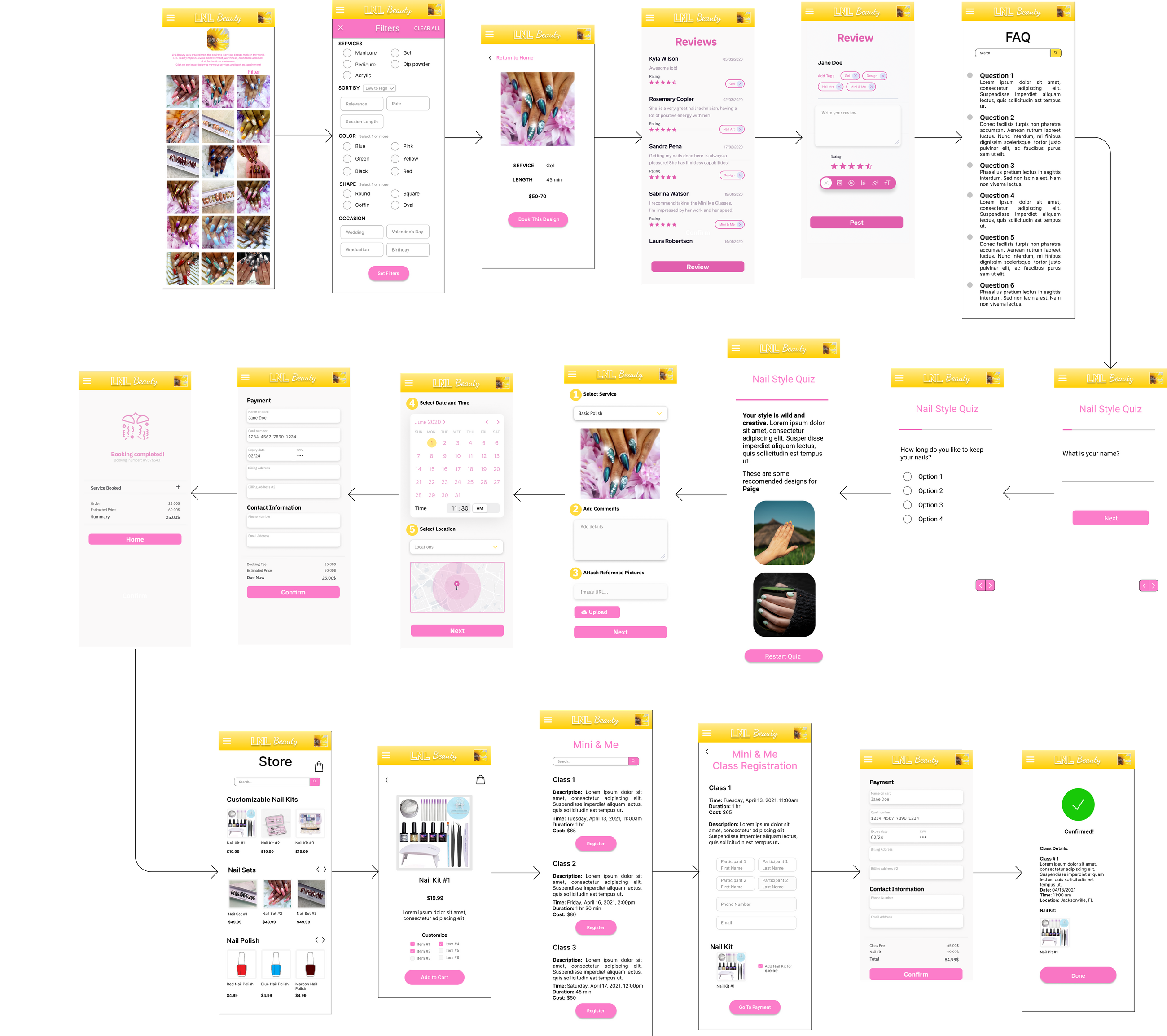
After revising and testing once more we got good feedback and we made our final interactive prototype in InVision, and created a video sketch. P.S. After revising the project a few months later, I thought the UI needed improvement so I went ahead and redesigned the aesthetic part of the app and made another prototype in Figma (the one embedded below).