
This project was part of a semester-long course on Human-Computer Interaction, where we were supposed to take a piece of software of our choice and redesign it based on user research and also develop a functional prototype with code. My team and I chose the web application Roll20 a virtual tabletop platform (VTT) used to play role-playing games (RPGs) with groups of people.
Roll20 is a browser-based virtual tabletop that gives users tools for creating, hosting, and partaking in virtual games.
Our team aims to ultimately maintain the accessibility of the Roll20 software while improving the interface so as to make the VTT more easily navigable and more intuitive to new and old users alike.
Roll20 is a free and highly accessible platform, which means that any advancements would benefit a large, diverse, and ever-growing community. Redesigning the interface would foster more seamless gameplay by allowing the interactions of and the connections in the game to take center stage.
Our target users were people who use the Roll20 platform or are interested in tabletop role-playing games (TTRPGs). In order to get our target user data, we decided to create a survey that was easily accessible to them. The survey was posted to public subreddits that were likely to contain Roll20 users, such as the following:


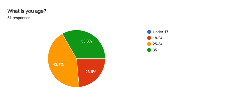
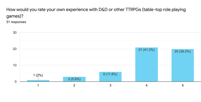
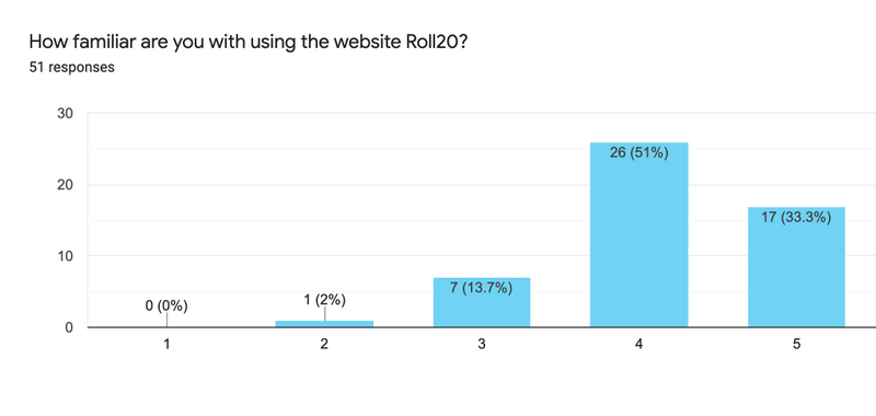
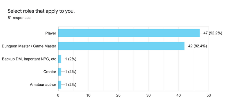
In total, 51 people completed the survey. Individuals were asked:
Reading the answers, it seemed like the people who completed the survey were mostly experienced players and had a lot to say about their Roll20 experiences. After analyzing the data, we concluded that the most important thing for the scope of this project was to eliminate unused features, and refine used ones (improving and simplifying the UX and UI of the platform).
The interface has two different views depending on the status of the user, GAME MASTER (GM) or PLAYER.
GAME MASTER VIEW
Insights
Allows users to create simple maps by layering art assets and images on top of each other, using a drag-and-drop interface.
Provides three layers to place assets: a background layer, a token layer, and a GM information overlay
Problems
Uploaded images are placed inside an unorganized art library, with no options to tag or label images.
There is little to no indication on what layer the user is currently on besides a vague icon change in a side toolbar. Items on the map toolbar are unlabeled, making it difficult for a new user to figure out a menu item’s function without consulting a user guide or using trial-and-error.
The user is given a lot of options without a lot of explanation of what those options will do.
PLAYER VIEW
Insights
Character sheets are placed in a “Journal” tab, alongside other handouts the GM has provided (additional maps, art, items, etc.).
Double clicking on the name of the modal will minimize it.
Whenever a player rolls a stat, the results of that roll are sent into the chat tab.
Problems
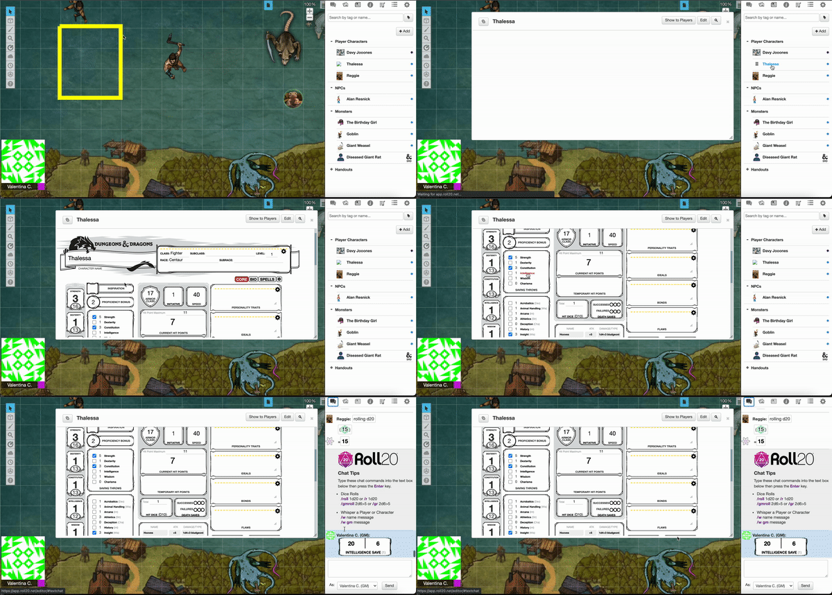
In order to access their character’s stats (a frequent interaction), the user has to open up the sheet in a separate modal that takes up most of the screen. This makes it difficult to view the map and the character sheet simultaneously.
There are no signifiers informing users that this is an available interaction.
Rolling dice occurs frequently, meaning that normal chat messages tend to quickly get buried underneath the influx of dice results.
Based on our survey, the main drawbacks of Roll20 are its:
With these drawbacks in mind, we strive to create a minimalistic VTT client that cuts down on the clutter and only has the best features for the VTT experience. Our initial design focused on:
The main features we changed are the following:
Character Sheet
In Roll20 the character sheet appears as a pop-up when clicking on the desired character in the journal, which is a bit inconvenient since it is one of the most necessary features that the players interact with.
The pop-up blocks the view of the map and makes things cluttered when trying to perform some actions and look at what is going on on the map simultaneously.
We decided to add it directly in a tab on the sidebar so it is more accessible and it doesn’t block any view.
Layers
Layers in Roll20 are handled from the map toolbar. The indication of which layer the user is in can be confusing for new users because the icons are not common and are hard to recognize.
The listed layers could only be seen when clicking on whichever icon is shown on the toolbar.
For a more straightforward approach we made the layers a small pop-up window that can be toggled with a button in the toolbar and added functionality so that users can add additional layers if they wanted to.
Art Library / File Manager
Our initial design consisted in a pop-out window that allowed the user to edit a character’s additional information like token, bio, GM notes, etc. As well as uploading and managing assets to add to the map and characters. Roll20’s interface consisted of a somewhat confusing layout, so out goal was to make categories more clear and everything more readable with accordion categories and images.
After we decided on our initial design, we started implementing the functional prototype. We used Create React App for quick set up and that got us started with our implementation.
System Languages
Our system is a web application that is made using ReactJS within JavaScript. CSS styling is also utilized with React.
Implementation
Our features are implemented mostly in the form of a sidebar, with each component having a separate tab within the sidebar. Some tabs, such as the Character Sheet, have even more subdivision tabs within them. The map screen is always visible.
Data Storage
Our system utilizes various JSON files in order to store information such as character data and chat messages locally. No online database or backend is utilized.
Participants in the study were guided through a think-aloud activity, asked to perform specific actions and narrate their thoughts as they navigated the systems.
When piloting the study, participants were asked to do things that interacted with the different components in each system: the map tools, the chat, the character sheet, the art library, the journal, and the settings. To maximize each participant’s time spent interacting with respective systems, they were given pre-setup character sheets.
The metrics were focused primarily around time, specifically the amount spent trying to find systems and complete tasks. Number of clicks were also considered to measure the amount of interactions taken to successfully navigate the system.
Despite some limitations due to partial or buggy implementations, the evaluation found that our team’s virtual tabletop was generally more efficient in terms of time spent finding and completing activities and button clicks taken. Participants using Roll20 faced larger learning curves and had longer times figuring out how to complete tasks. Participants in the former group commented on visual ease, while participants in the latter group voiced thoughts concerning having difficulty finding elements and feelings of the interface being disorganized. This may contribute to the greater efficiency of the former group.